

Understanding the US economy requires more than glancing at stock charts or interest rate headlines. This guide dives into 12 critical economic indicators—including the Federal Funds Rate, inflation metrics (CPI & PPI), unemployment, real GDP, 10-year Treasury yields, and the S&P 500—revealing how they interact to shape markets, consumer spending, and investment decisions. By analyzing 72 months of Federal Reserve and market data, we uncover patterns in interest rates, stock performance, inflation trends, and labor market shifts, helping investors, policymakers, and informed citizens anticipate economic turning points, gauge market risks, and make smarter financial decisions. Whether you’re tracking S&P 500 performance, evaluating inflation’s impact on your wallet, or interpreting yield curve signals, this dashboard provides actionable insights across the US economic landscape.
Why This Economic Dashboard Matters to You
Rather than treating economic indicators as isolated data points, this guide connects the dots between monetary policy, inflation dynamics, labor market conditions, bond yields, and equity market performance. You’ll see how Federal Reserve rate decisions ripple through mortgage costs, consumer prices, employment trends, and ultimately S&P 500 earnings and valuations. By combining macroeconomic theory with real-world data visualization—correlation matrices, yield curve analysis, and regime-based market performance—this dashboard explains not only what the numbers say, but why they matter and when their impact is most likely to be felt. From identifying recession warning signals to understanding why stocks sometimes rise during restrictive policy cycles, this analysis equips you with a practical framework for reading the US economy with confidence.
Part 1: The Economic Indicators Explained
1. The Federal Funds Rate – The Economy’s Thermostat
What It Is: The interest rate banks charge each other for overnight loans. Think of it as the base rate that influences every other borrowing cost in the economy—from mortgages to business loans.
How It’s Set: The Federal Open Market Committee meets eight times yearly to adjust this rate based on economic conditions. Our data shows it ranged from an emergency low of 0.05% during pandemic recovery to 5.33% during inflation fights.
What It Tells Us: This is the Federal Reserve’s primary tool for managing economic growth. When the economy overheats (high inflation), they raise rates to cool spending. When it slows too much, they cut rates to stimulate activity.
Beginner Tip: Watch for changes in this rate—they’ll affect your savings account yields and loan costs within months.
Expert Insight: The “real” federal funds rate (adjusted for inflation) matters more than the nominal rate. When real rates turn positive, policy is genuinely restrictive.
2. Inflation Metrics – Tracking Your Dollar’s Purchasing Power
Consumer Price Index (CPI)
What It Is: Measures price changes for a basket of goods and services typical consumers buy.
How It’s Calculated: Statisticians track prices of 80,000+ items across categories. The index formula compares current costs to a base period:
Current Cost of Basket ÷ Base Period Cost × 100
Our data shows CPI climbed from 255.80 to 325.03 over six years—meaning what cost $100 in the base period now costs $127.
Core CPI (Excluding Food & Energy)
Why It Exists: Food and energy prices swing wildly due to weather, geopolitics, and speculation. Core CPI strips these out to reveal underlying inflation trends.
Key Finding: Core CPI consistently runs slightly higher than headline CPI in our dataset, suggesting food/energy prices sometimes provide temporary relief from broader inflation pressures.
Producer Price Index (PPI)
The Early Warning System: Tracks prices producers receive for their goods. Since producers often pass costs to consumers, PPI typically leads CPI by several months.
3. The Unemployment Rate – More Than Just a Number
What It Is: Percentage of the labor force actively seeking but unable to find work.
Calculation:
(Unemployed People ÷ Labor Force) × 100
Important Nuance: The “labor force” excludes those not looking for work (students, retirees, discouraged workers), which sometimes creates misinterpretation.
Our Data Insight: Unemployment ranged from 3.4% (very tight labor market) to 14.8% (pandemic peak) during our analysis period.
4. Real Gross Domestic Product – The Economy’s Report Card
What It Is: Total value of all goods and services produced, adjusted for inflation.
Key Distinction: “Real” means inflation-adjusted. “Nominal” GDP includes price increases and can be misleading during high inflation periods.
Why It Matters: Two consecutive quarters of declining Real GDP equals a recession—this definition held during every modern US recession.
5. 10-Year Treasury Yield – The Market’s Crystal Ball
What It Is: Return investors demand to lend money to the US government for 10 years.
How It’s Set: Auction-based, reflecting collective investor expectations about future inflation, growth, and Federal Reserve actions.
Critical Insight: When long-term yields fall below short-term rates (an “inverted yield curve”), it often signals recession expectations. Our data shows this occurred for 31 of 72 months (43.1% of the time).
6. S&P 500 – Corporate America’s Pulse
What It Is: Market value of 500 large US companies, representing approximately 80% of total US stock market capitalization.
How It’s Weighted: Companies with larger market values have greater influence on index movement—this differs from equal-weighted indices.
The S&P 500 Index: Structure, History, and Investment Strategies
S&P 500 Index Performance and Earnings Anatomy (2020–2025)
S&P 500 Stocks’ Performance Analysis Dashboard
NASDAQ Post IPO Performance Reality (2023–2025)
Part 2: How to Read the Correlation Matrix
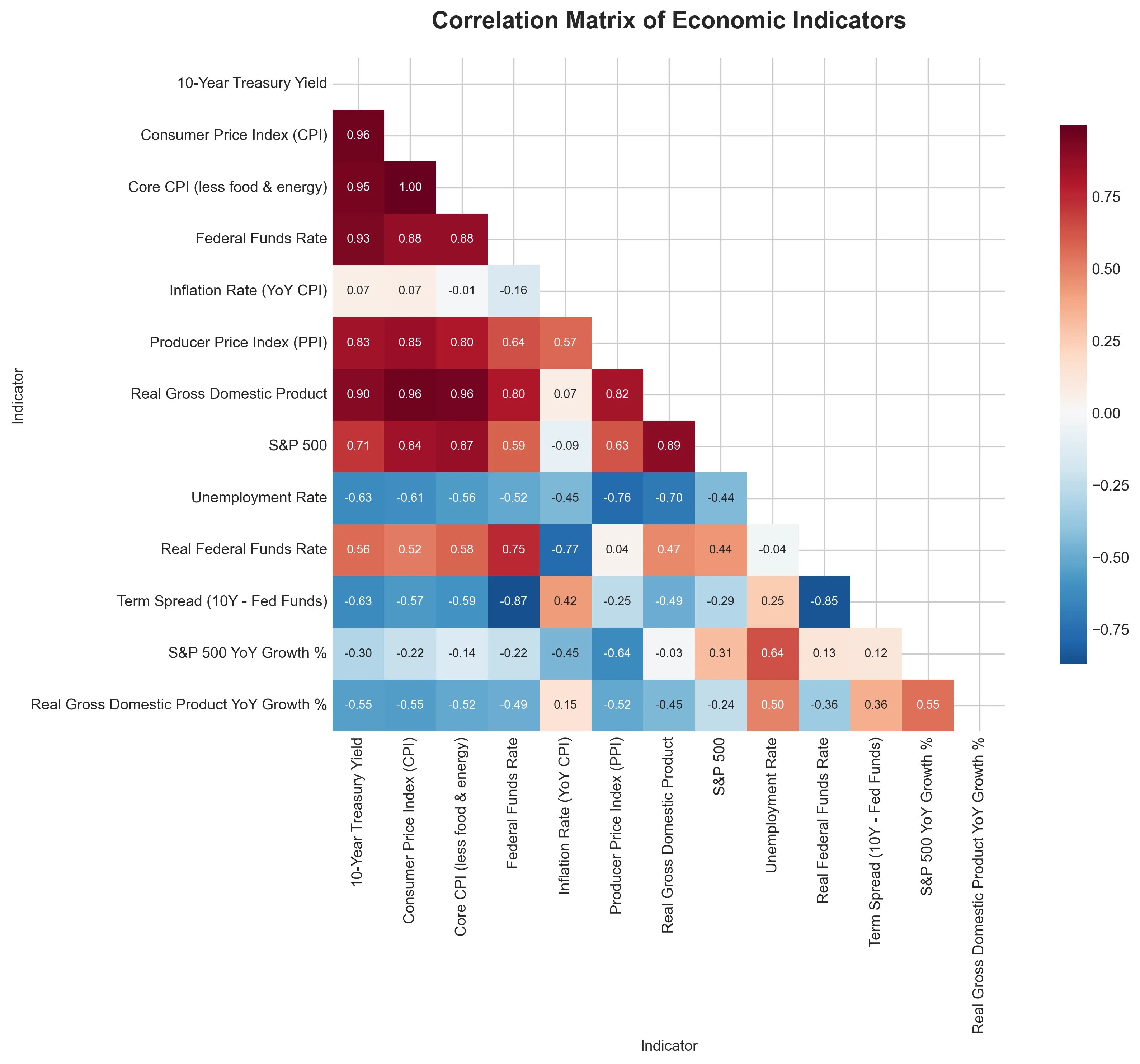
Below is the correlation matrix from our analysis—a heatmap showing how indicators move together. Red indicates negative correlation (they move opposite directions), blue indicates positive correlation (they move together). The asterisks (***, **, *) show statistical significance.
Three Key Relationships Revealed
1. The Inflation-Interest Rate Link
Notice the strong positive correlation (0.931*)** between the 10-Year Treasury Yield and Federal Funds Rate. When the Fed raises short-term rates, long-term rates typically follow—though not always perfectly. This relationship forms the basis of monetary policy transmission.
2. The Stock Market’s Dual Personality
The S&P 500 shows strong positive correlation with GDP (0.891*)**—corporate profits track economic growth. But it has negative correlation with unemployment (-0.436*)**—falling unemployment often signals economic strength that supports stocks.
3. The Surprising Inflation Puzzle
Inflation Rate (YoY CPI) shows weak correlation with most indicators except Producer Price Index (0.568*) and negative correlation with Real Federal Funds Rate (-0.768*). This reveals inflation’s complexity—it responds to monetary policy but with unpredictable lags.
How to Interpret Correlation Values
- 0.8 to 1.0 (or -0.8 to -1.0): Very strong relationship
- 0.6 to 0.8 (or -0.6 to -0.8): Strong relationship
- 0.4 to 0.6 (or -0.4 to -0.6): Moderate relationship
- 0.2 to 0.4 (or -0.2 to -0.4): Weak relationship
- 0.0 to 0.2 (or 0.0 to -0.2): Negligible or no relationship
Part 3: Visualizing the Economic Story
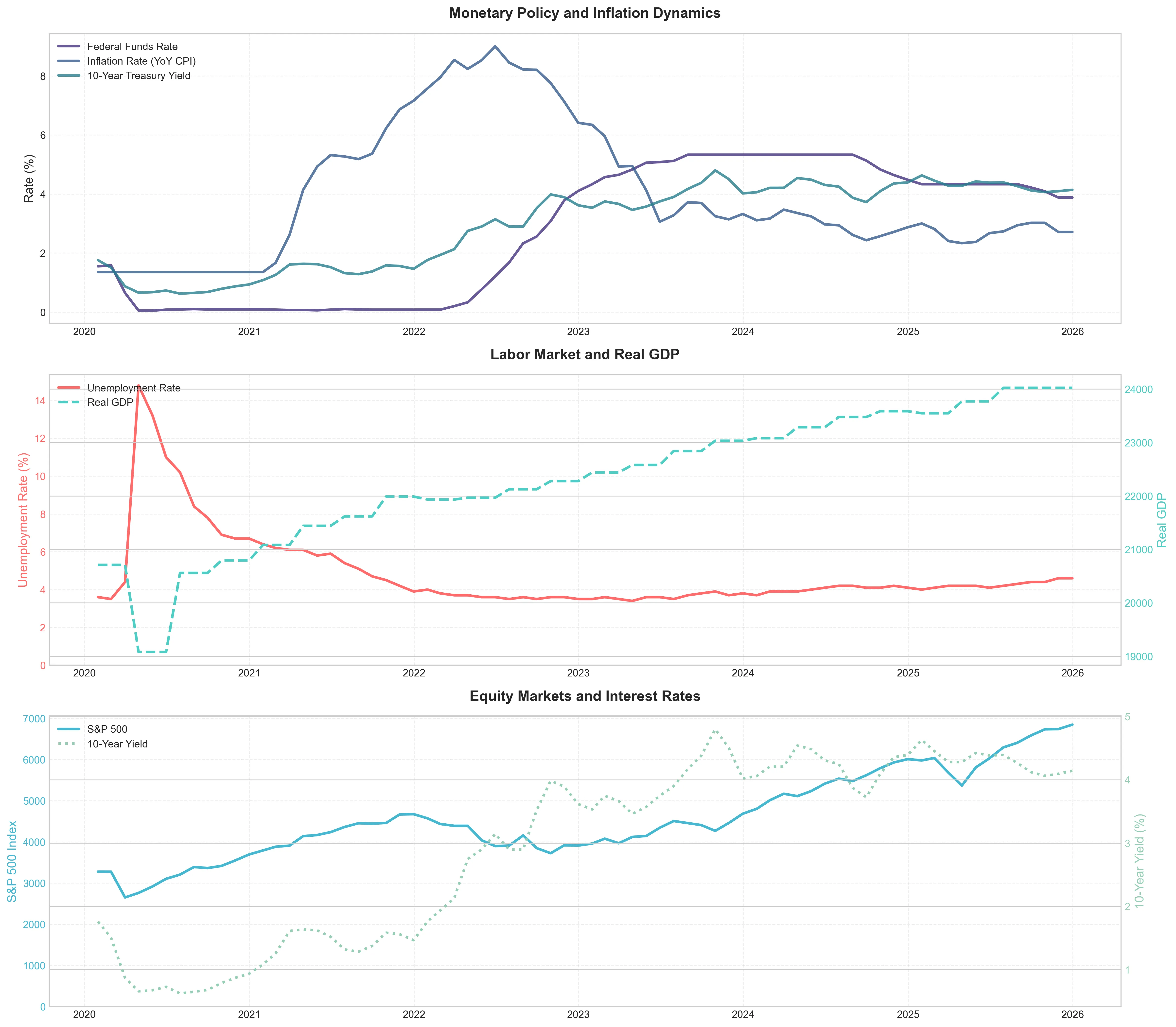
The Complete Economic Picture
What Beginners Should Notice:
- Gray shaded areas represent economic stress periods—multiple indicators move together
- Federal Funds Rate (blue) often changes direction before inflation (red)
- Unemployment (orange) typically rises after other indicators weaken
Expert Takeaways:
- Policy Lag Effect: Fed rate hikes (blue line) begin before inflation peaks, showing proactive policy
- Market Anticipation: Stock market (S&P 500) often turns before confirmed economic weakness
- Yield Curve Signals: Inversions (10-year yield below Fed Funds) precede economic slowdowns
Inflation: Headline vs. Core
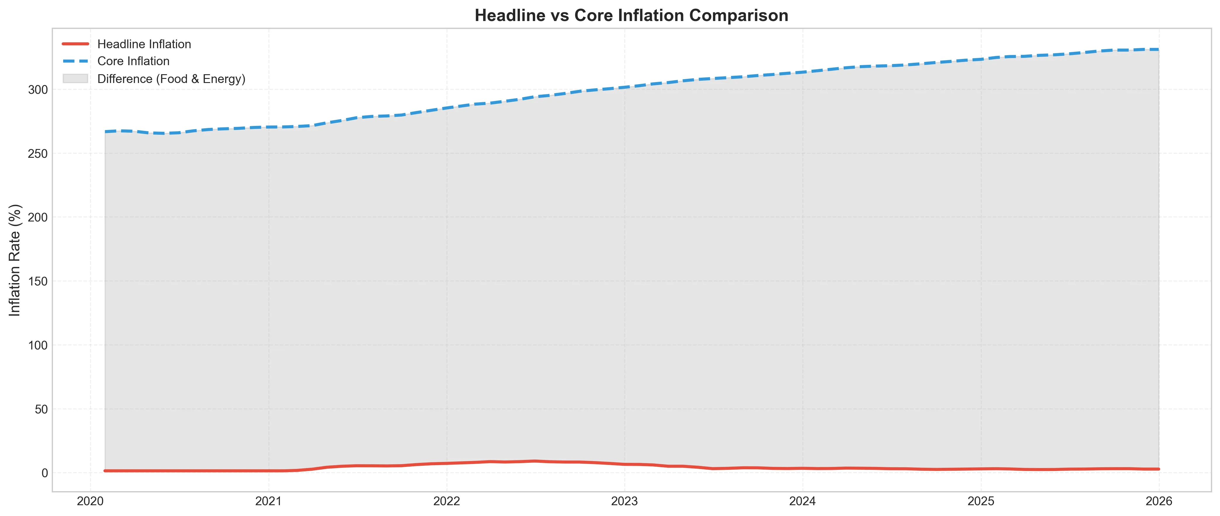
The gap between red (headline CPI) and blue (core CPI) lines represents food and energy inflation. Notice how this gap widens during supply shocks (like pandemic disruptions) and narrows during stable periods.
Real vs. Nominal Interest Rates
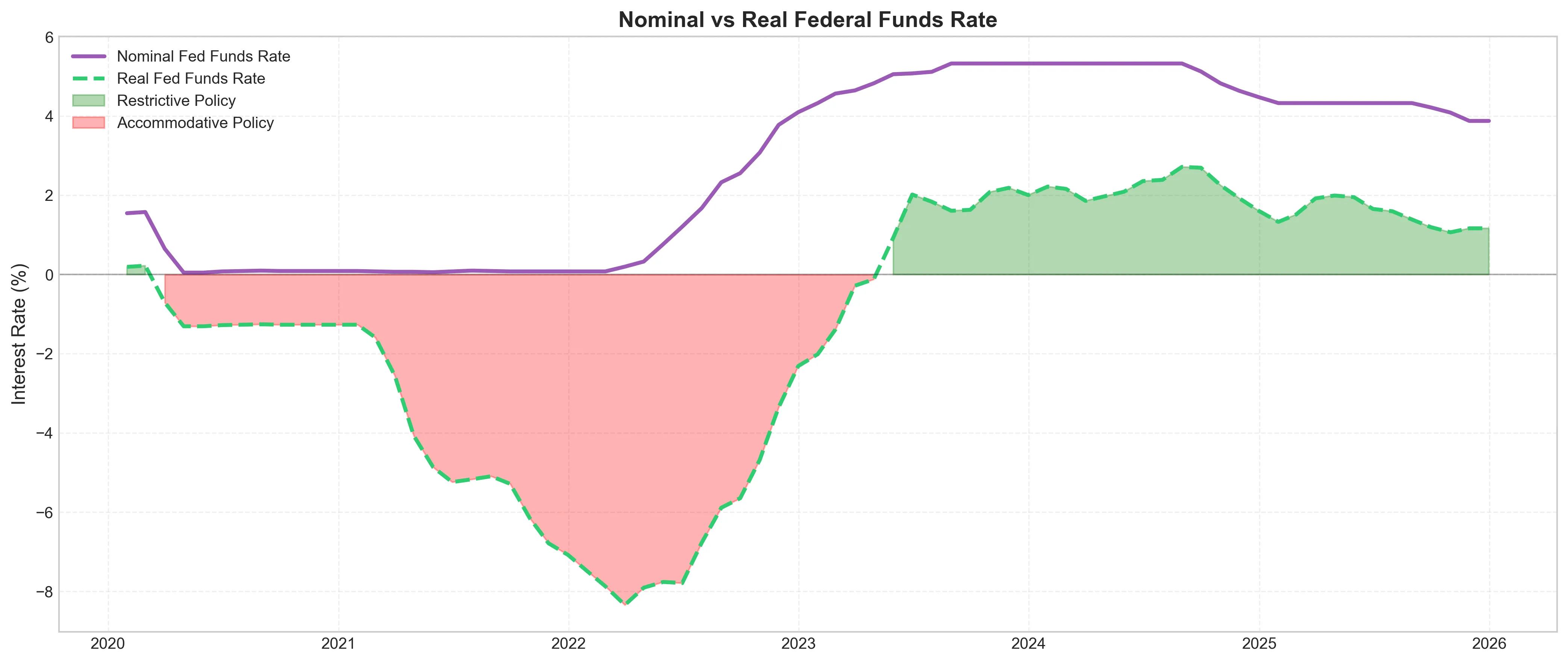
Key Insight: The green shaded areas show when policy was genuinely restrictive (real rates > 0). Despite nominal rates hitting 5.33%, real rates only reached 2.72%—highlighting how high inflation erodes policy tightness.
Yield Curve Analysis
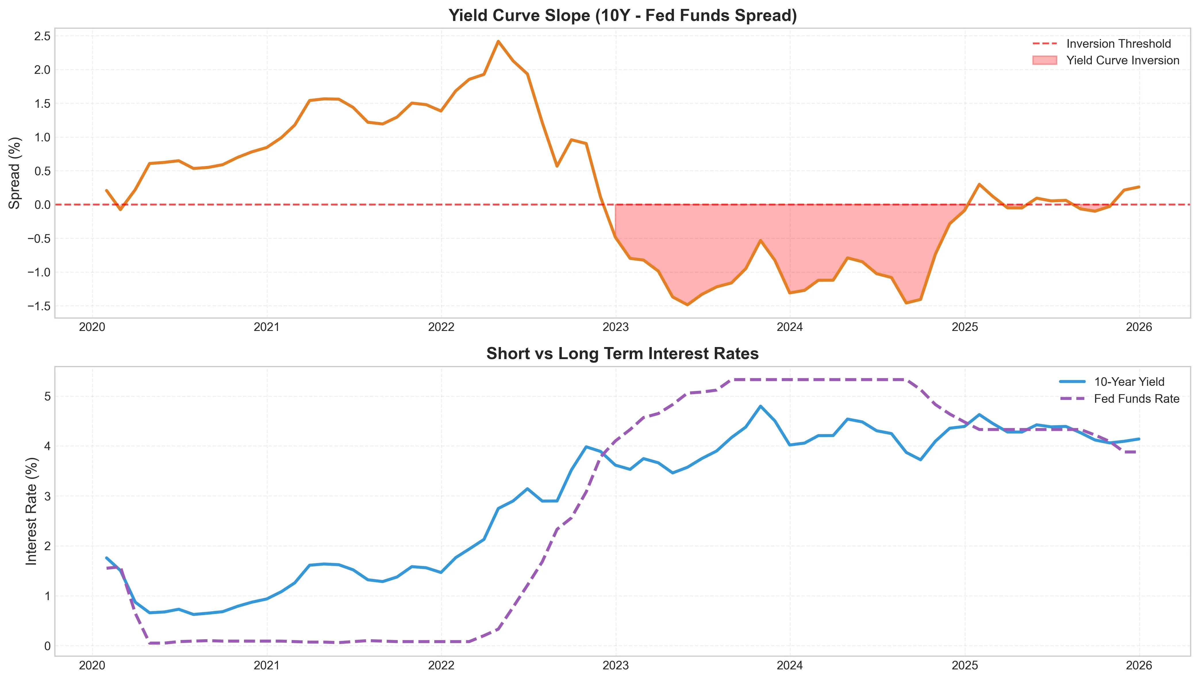
The top chart shows the term spread (10-year yield minus Fed Funds Rate). Red shaded areas mark inversions—historically reliable recession predictors. The bottom chart shows how short and long rates move both together and separately.
Part 4: Critical Data Tables and Their Insights
Table 1: Recent Changes in Key Indicators
| Indicator | Latest Value | Month Ago | 3 Months Ago | 12 Months Ago | MoM Change | QoQ Change | YoY Change |
|---|---|---|---|---|---|---|---|
| 10-Year Treasury Yield | 4.14% | 4.09% | 4.12% | 4.39% | +0.05 | +0.02 | -0.25 |
| Federal Funds Rate | 3.88% | 3.88% | 4.22% | 4.48% | 0.00 | -0.34 | -0.60 |
| S&P 500 | 6,848.37 | 6,740.89 | 6,584.02 | 6,010.91 | +107.49 | +264.36 | +837.46 |
| Unemployment Rate | 4.60% | 4.60% | 4.40% | 4.10% | 0.00 | +0.20 | +0.50 |
| Inflation (YoY CPI) | 2.71% | 2.71% | 3.02% | 2.87% | 0.00 | -0.31 | -0.16 |
What This Tells Us:
- The Fed has paused rate hikes (unchanged for 3 months)
- Stocks continue climbing despite higher rates
- Unemployment has risen 0.5% year-over-year
- Inflation shows modest deceleration
Table 2: Economic Performance Across Policy Regimes
| Policy Environment | Average S&P 500 | Average Unemployment | Average Inflation |
|---|---|---|---|
| Highly Accommodative (Real Rates < -2%) | 4,204.06 | 4.30% | 6.76% |
| Moderately Accommodative (Real Rates -2% to -1%) | 3,430.91 | 8.49% | 1.77% |
| Neutral (Real Rates -1% to 1%) | 3,574.02 | 3.67% | 3.01% |
| Moderately Restrictive (Real Rates 1% to 2%) | 5,796.07 | 4.13% | 2.94% |
| Highly Restrictive (Real Rates > 2%) | 5,054.71 | 3.94% | 2.98% |
Surprising Finding: Stocks performed best during moderately restrictive periods (real rates 1-2%), challenging the conventional wisdom that low rates always boost markets.
Table 3: PPI as a Leading Indicator for CPI
| Lag (Months) | Correlation | Relationship |
|---|---|---|
| -6 (CPI leads by 6 months) | 0.2041 | CPI Leads PPI |
| 0 (Simultaneous) | 0.5676 | Simultaneous Movement |
| +3 (PPI leads by 3 months) | 0.6201 | PPI Leads CPI |
| +6 (PPI leads by 6 months) | 0.6195 | PPI Leads CPI |
Critical Insight: The strongest correlation (0.6201) occurs when PPI leads CPI by 3 months. This means producer price changes today give us a reliable signal about consumer inflation 3 months from now.
Part 5: Putting It All Together – Current Economic Assessment
Based on our analysis of 72 months of data through the latest readings:
Current Economic Stance: Moderately Restrictive
- Real Federal Funds Rate: 1.17% (within 1-2% “moderately restrictive” band)
- Term Spread: 0.26% (slightly positive, not inverted)
- Misery Index (Unemployment + Inflation): 7.31% (below the 10% “high misery” threshold)
Three Signals Worth Watching
- The Yield Curve Normalization: After 31 months of inversion (43.1% of our dataset), the curve has normalized to a positive 0.26% spread. Historically, this suggests recession risks may be receding.
- The Inflation Trajectory: With PPI at 262.34 and CPI at 325.03, the producer-consumer price gap suggests continued but moderating inflation pressure.
- Policy Effectiveness: The Real Federal Funds Rate of 1.17% indicates policy is restrictive enough to impact inflation but not so tight as to cause severe economic contraction.
Part 6: Frequently Asked Questions
Q: Which single indicator should I watch most closely?
A: For most people, the Real Federal Funds Rate (Fed Funds minus inflation) offers the clearest policy stance. When it turns positive, borrowing genuinely tightens. Our data shows it averaged -1.22% but recently turned positive.
Q: How reliable is the yield curve for predicting recessions?
A: Historically, inversions have preceded the last 7 recessions by 6-24 months with no false signals. Our data shows the curve was inverted 43.1% of the time, suggesting prolonged recession concerns during this period.
Q: Why did stocks perform best during moderately restrictive periods?
A: This counterintuitive finding suggests markets prefer clarity and stability over extreme accommodation. Moderately restrictive policies often coincide with strong growth and controlled inflation—the “Goldilocks” scenario for corporate profits.
Q: How quickly do Fed rate changes affect my daily life?
A: With varying lags:
- Credit cards: 1-2 billing cycles
- Savings accounts: 1-3 months
- Mortgages: 1-3 months (adjustable rates), longer for fixed
- Auto loans: 1-2 months
- Overall economy: 6-18 months
- Inflation: 12-24 months
Conclusion: Your Economic Dashboard Checklist
Understanding these indicators transforms you from a passive observer to an informed participant in the economy. Here’s your actionable checklist:
- Monthly Check: Review CPI and unemployment (released monthly)
- Quarterly Review: Examine Real GDP and corporate earnings
- Fed Watch: Mark 8 FOMC meeting dates yearly
- Market Signals: Monitor yield curve and real interest rates
- Leading Indicators: Watch PPI for inflation clues 3 months ahead
Remember: No single indicator tells the whole story. The true power comes from understanding how these 12 signals interact—exactly what we’ve visualized and analyzed here.
Final Thought: Economic indicators are a dashboard, not a crystal ball. They show where we’ve been and suggest where we might be headed, but surprises happen. The prepared mind understands both the indicators and their limitations.
*Data Sources: All data sourced from FRED (Federal Reserve Economic Data). Analysis period: 72 months through latest available data. Analysis performed using Python with pandas, matplotlib, and seaborn libraries. Correlation significance: *** p<0.001, ** p<0.01, * p<0.05.*
About the Analysis: This examination goes beyond surface-level indicator reporting to reveal interconnected relationships that often predict economic turning points months in advance. By understanding these relationships, investors, policymakers, and informed citizens can make better decisions in an increasingly complex economic landscape.
Written By-Md Kollol Hossain, CEO, CapitalinsightBD
This article is for educational purposes only and does not constitute financial or investment advice.